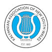

UNVEILING OF THE NEW KALYMNIAN YOUTH SOCIETY OF NSW LOGO
Updated: Sep 12
The new Kalymnian Youth Society logo has been developed to create visual harmony and brand unity with the parent logo of the Kalymnian Association of NSW. As a subsidiary organisation, the Youth Society operates within the Association’s established brand hierarchy, ensuring both identities share a consistent visual language while remaining distinct in purpose.
The design retains the Perikefalea as its core symbol, honouring the youth committee’s original concept and preserving a direct link to Kalymnos. It has been refined into a modern, streamlined form aligned with the KANSW master logo.
Within the porthole, the cross reinforces our Greek Orthodox foundations, while the side portholes subtly reference headphones as an understated nod to youth, music and celebration. The KYΣ monogram has been retained from the original logo, sharpened for clarity, reflecting naming conventions used across Greek youth associations.
The roundel structure anchors the brand: “KANSW Est. 1951” at the base acknowledges the Kalymnian Association of NSW as the Youth Society’s foundation, while the full name of the youth committee sits proudly at the top, establishing identity and pride. All typography, line weights and structural elements mirror the parent logo to ensure continuity, cohesion and a clear sense of one family moving in the same direction.
The turquoise colour introduces a fresh and contemporary tone. When paired with the Kalymnian Association of NSW's blue, the palette evokes the waters of Kalymnos as an authentic reference to the island’s seafaring heritage.
We acknowledge and thank Vice President of the Kalymnian Association of NSW, Mr. George Karantonis of Image Smart for his excellent work in designing this masterpiece.
We wish our youth every success in upholding our collective mission.
.


